What we're listening to in the studio.
View more at our Last FM page

28 June 2012
Many of our clients are interested in responsive design and the benefits it brings but they struggle to grasp the concept - it can be a difficult one to explain!
So we figured it may prove helpful to take a look at some examples of responsive design and explore what makes them successful.
First, a quick overview of what responsive design is and more importantly, what it enables!
Ethan Marcotte, who coined the phrase responsive design sums up the technique:
“By marrying fluid, grid-based layouts and CSS3 media queries, we can create one design that’ responds to the shape of the display rendering it. It’s a more unified, more holistic approach to design, one that doesn’t see the web’s inherent flexibility as a constraint to be limited.’ -‘Ethan Marcott’
This may sound a little abstract to the uninitiated, bear with us - the examples will hopefully help!
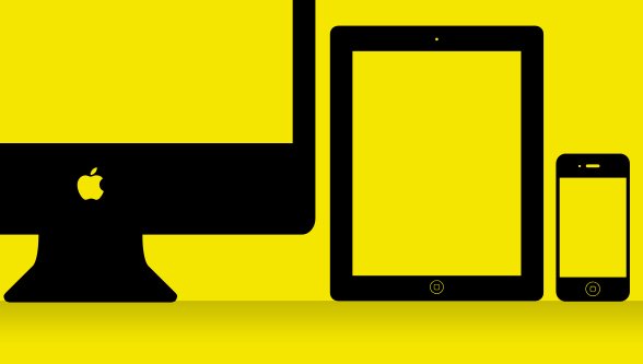
If you’re a brand or marketing manager this is the important bit…
No matter what the make and model, software (iOS, Android, Symbian, Blackberry, etc) or screen size, your customers can interact with ease, giving you greater access to your consumer base than ever before.
Whether your website is focused on e-commerce, brand awareness, content publishing or any other area, responsive design opens the flood gates to all visitors.
A brief note before we get to those examples, if you don’t have the luxury of having many devices to hand - desktop, tablet, mobile etc. - you can adjust the width of your browser window to mimic the view-port of a device with a smaller screen.
The Boston Globe website is widely considered to be a milestone example of responsive design. Ethan Marcotte’s influence combined with support from two local Boston development teams made for a fantastic combination.
Notice these simple and understated effects when adjusting the browser width on the Boston Globe’s website.
The big picture here is easy.
Jeff Moriarty, the Globe’s vice president of digital products, said ‘We really wanted to introduce app-like features and focus on readability,’ He then explained, ‘This is a Web app in a lot of ways. We are not launching a native app at the same time ‘ we think this accomplishes a lot of the same things we would normally do with a native app.’
So they built one website to satisfy all needs independent of the device used to access the website.
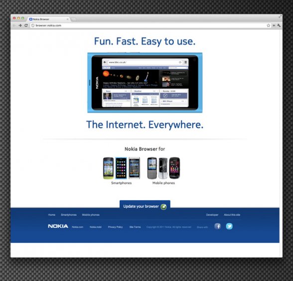
http://yiibu.com (and Nokia)
Yiibu is another excellent example of the latest development techniques in action. This site was built as proof of concept and then the process and planning was documented on the company blog.
Once they proved the concept of responsive design they went on to build a new site, using that concept, for Nokia.
Due to the planning and development methods used, you will always be able to access the content on any device - no matter how old it is. On the yiibu site you can see the following changes when adjusting the browser width:
Moving beyond yiibu’s own website; yiibu applied their newly found experience in a website developed for Nokia. Nokia has had internet ready mobile devices for a very long time. With one site Nokia was able to deliver content to fit every device they had previously built as well as devices they have yet to build. You can see Nokia’s site here: http://browser.nokia.com/
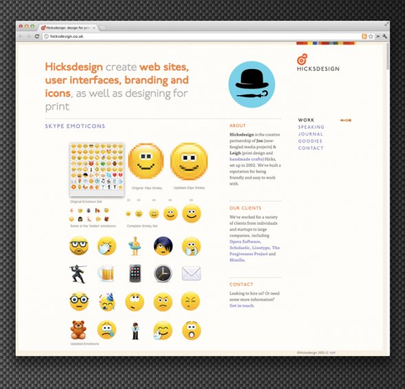
Hicksdesign are well known for their interface design work. Adopting responsive design for their own website makes sense as it positions them as forward thinking thought leaders in their field.
Watch out for the following changes when adjusting the browser width:
We’re sure it was a ‘no questions asked’ decision for them to implement responsive design. Every visitor to their website sees an innovative, up-to-date site that stands as a live testament/testimonial for potential clients.
The process that goes into developing a website using responsive design takes a great deal of planning and organisation by all the project stakeholders.
Where we previously developed for digital devices independently of each other, allowing for separate builds spread out over months, if not years, such as a desktop, mobile or tablet version, this must now be considered at the onset.
Responsive design requires foresight and planning that will keep the end product functional and capable for existing devices and those not yet invented!
Many evangelists argue the case for responsive design on all occasions, however responsive design is not a “magic bullet” for all situations. Some would argue (rightly so) that it is not always the way to go, in the right scenario a highly bespoke and more ‘app’ like experience can yield better results.
If you’ve worked with us before, you’ll know that we’re not keen on cookie cutter solutions. Every client is unique and ultimately the needs of the audience and the client must be considered for each project on a case by case basis - that’s how we generate success!
You can see an example of one of our solutions by visiting our sk:n case study.
If you’re looking for a digital solution to deliver your message to your audience contact us at [email protected] or @studioskylab.
The latest feeds from the studio powered by Yahoo Pipes.